
What to Wear to Your Brand Photoshoot
You just booked your brand photoshoot and now you’re sifting through your closet muttering, “What to wear, what to wear.”
Thoughts may drift to whether you need to go online shopping (you just got emailed a coupon, right?) or if you need to hit up that boutique you passed three weeks ago.
However, in most scenarios, you’ll already have what you need for the brand photoshoot in your closet. If you want to do a little shopping beforehand for something a little special, I support that! Either way, read through these suggestions when choosing what to wear.
Casual or Formal?
Keep in mind that your brand photographs symbolize the new direction you and your business is taking. So if that means you want to appear more down-to-earth, whip out your favorite pair of jeans. But if you want your business to come across as more elevated and formal, dress accordingly! And, remember, formal can totally carry a punch of personality and does not need to be “stiff.”
Colors
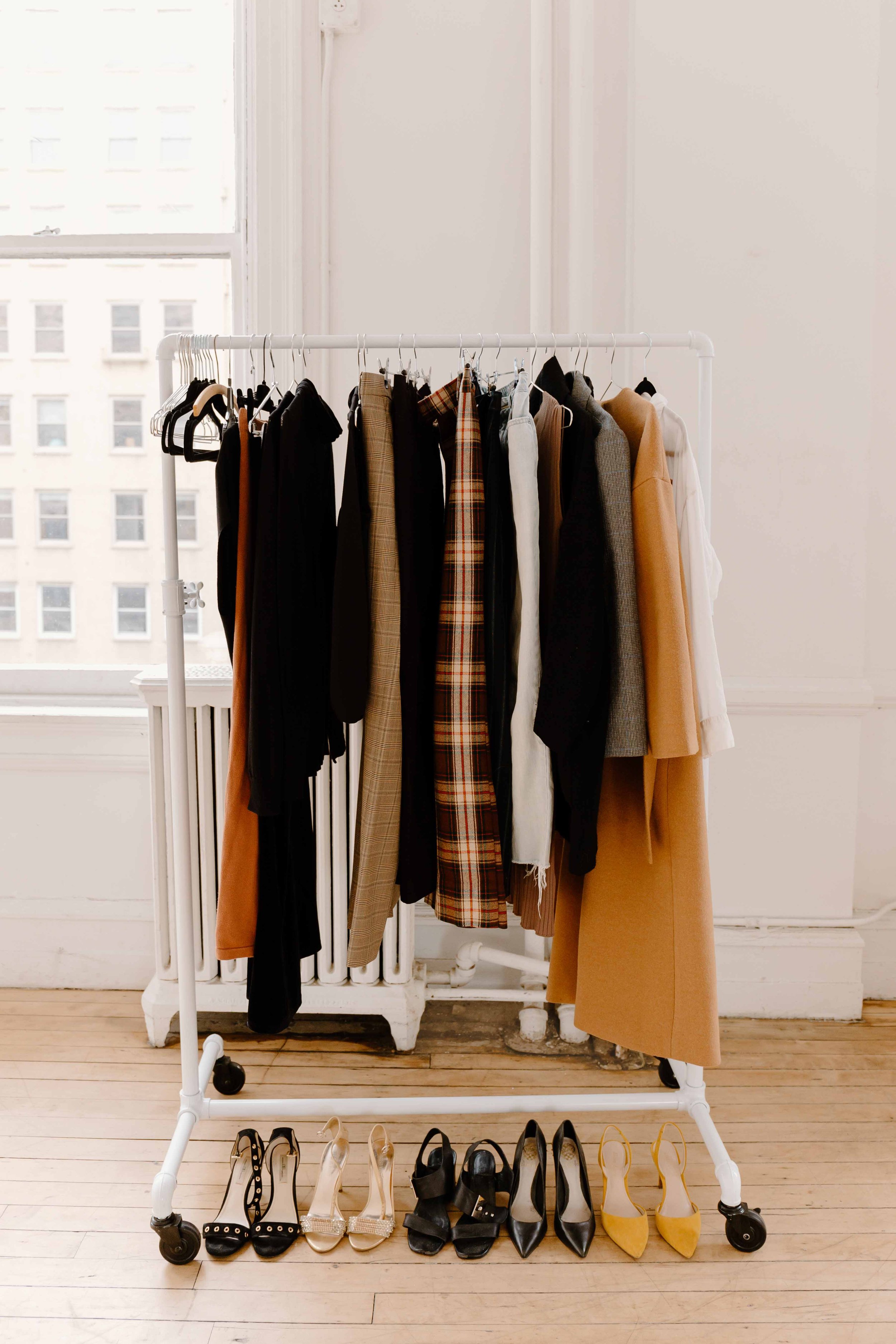
The goal with color is for it to always complement and flatter you, not to compete with you… or with the background. For example, if you are shooting in mostly white-furnished studio, a pop of color works great and neutrals work great as well. But if you are photographing in a very green park, it may be more visually inviting to wear a neutral color or color similar to or reflective of the park’s natural colors.
When in doubt, I recommend neutral colors or colors you usually get complimented in — that’s usually a sign that the color flatters your complexion.
I have also found that any sort of lettering on clothes (a brand name or a slogan) tend to not photograph well. (The lettering can get scrunched up and is often distracting.)
Another aspect of color to think about — especially for headshots — relates to your hair color. If you have long hair and plan on wearing it down for the shoot, I recommend you choose a contrasting top. For example, if you have dark long hair and wear a dark top, your hair and top, in photographs, will seem to blend and it won’t help in creating a flattering contrast.
Skin Undertones
People tend to have warm undertones, cool undertones, or neutral undertones and if you wear colors that correlate to your undertone, you usually tend to look vibrant and healthy.
Have you ever tried on clothes in the dressing room and some clothes (purely based on color!) make you look well-rested and others make you look tired?
That’s because some color complement your skin undertone, and others do not.
If you are unsure of which undertone you have, reflect on what jewelry you tend to wear. If you look better in gold jewelry, you most likely have a warm undertone and look better in colors that also have a warm undertone. If you look better in silver jewelry, you most likely have a cool undertone and look better in colors that also have a cool undertone.
For example, I have a warm undertone, so a warm pink will always look better on me compared to a cool pink. Use this knowledge when choosing which outfits and accessories to incorporate into your shoot.

Textures
Textures can photograph beautifully. In my opinion, the small detail that texture adds can really enhance a photograph. For example, the way satin adds a certain mood, or chiffon, or denim. Also, keep in mind that if you plan on wearing a thinner fabric, I encourage you to check if a bright light pointed at your clothing makes any of your undergarments show (unless, of course, this is purposefully the look you are going for!). Please also ensure that your clothing is wrinkle-free and doesn’t have any pilling (when small fluff piles up, usually on cotton clothes or knitwear).
Fit
As a general rule, I think clothes that gently hug your body are most flattering. Loose clothes tend to create loose shapes that aren’t super flattering. That being said, loose clothes can purposefully be used to create movement in photographs and that, I think, is a unique purpose. Also, I love pairing a loser top with a tighter bottom, or a tighter top with a loser bottom.
Quality
We all have our beloved favorite items of clothing. The ones that feel like home, especially when we don’t feel at home. In that case, it may be tempting to reach for your most comfy clothes because you don’t want to feel uncomfortable in front of the camera, but before you do, really try to look at them from a third person’s perspective. Sometimes we don’t realize that our favorite shoes actually look older than we thought until we really sit back and study them.
Quantity
Every photographer is different, but I’ve learned that to best serve my clients’ needs, I don’t offer a limited amount of outfit changes. I always tell my clients that you can bring as many outfits as you want, but that any time they are changing is time taken away from us shooting. When planning outfits, it may be helpful to think of which ones you can mix and match. For example, can you wear the same black slacks for a couple of outfit changes and just change out the tops and accessories?
Matching
When taking photographs with other people (your colleagues, your partner, etc.), I encourage you to makes sure the colors are of the same intensity. For example, the final photographs will look a bit messy if someone is wearing a pastel pink and someone else is wearing a bold red.
If you have time, I recommend taking a few test shots to see how those photos look with you together. It can be a bit different to only look at clothing laid out, or to only look at yourselves in a mirror, so snap some shots on your phone and study if the outfits complement each other.
Accessories
These are so important and they can tell us a lot about your personality! Think: necklaces, bracelets, belts, hats, layers (like jackets, scarfs), and bags. These items are also great for detail shots.
Props
Think of props as an extension of your outfit. They should still holistically match your outfit. For example, if you are wearing neutrals and want to include a journaling shot, a neon green notebook would look jarring.
Props are also a great way to incorporate your brand colors (i.e. phone case, laptop case, mug color, accents in the studio, etc.).

Last Thoughts
Keep your location in mind
With a studio rental, it’s much easier to “create” the environment you need. I’ll work with you to find a studio that complements your brand.
When choosing an outdoor location, I recommend thinking of the general color palette and planning your outfits accordingly.
I also highly recommend location scouting to make sure it’s what you are envisioning. Sometimes photos (or Google Maps) are years outdated and that street art you thought was there, is now no longer there. You’ll also realize that locations really change during the seasons. If you visited a certain location in the fall, but then you’re booking a spring photoshoot at that same spot, know that it will most likely offer a completely different vibe.
My general recommendation
I tend to think that lots of different types of solid colors photograph well, as long as they are complementary to the background so they don’t compete and create a visually overwhelming photograph. Patterns also photograph beautifully, as long as they aren’t distracting or overwhelming. (Typically, smaller patterns are a safer choice than larger ones.) I also find that the photographs of clients who have paid specific attention to accessories create thoughtful portraits that carry a lot of detail and personality.
Overall, remember that the brand photoshoot is for you and your business and that you should always remain center stage, with your your clothes + accessories complementing you, not overpowering you.